Azure has started to grow on me. I could imagine myself, a couple years ago, lamenting their poor non-Windows support, clumsy user interfaces (and APIs), and overall “beta dog” performance. Fortunately for cloud users like myself, Microsoft is hungry, and has heavily invested in Azure, becoming very competitive in a very short amount of time. One aspect of Azure I didn’t expect to like however, was their web UI. If you’re already familiar with the AWS web dashboard, you’re probably accustomed to…low expectations, so just about any web interface designed later than 2008 would be an improvement in comparision. Fortunately for me (and you if you use Azure), the Azure “blade UI” was designed more recently, and was clearly created by a team of thoughtful UI designers rather than engineers.
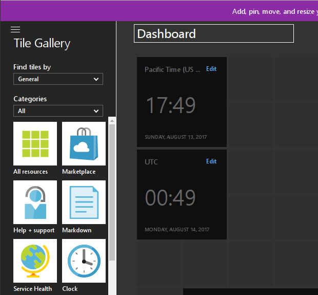
The first landing page for any Azure user, before they navigate into the “blades”, is the Azure Dashboard. Unlike the AWS dashboard/home page, theAzure Dashboard is customizable, insofar that you can add and arrange pre-defined “tiles” to your heart’s content. When I first started to use Azure, I made my best Liz Lemon eye-roll: “wow, I can rearrange clock tiles, how novel.” Then I discovered one little feature, which I began to abuse almost immediately: the Markdown tile.

Most infrastructure folks have graphs in Graphite, or another data provider, which give them additional useful summarized information. Personally, I have information from Jenkins, which I would like to always be present. Since Markdown supports embedding images, as you can see above, any service which can generate an image asset, can provide information into the Azure Dashboard. In the realm of Jenkins, I recommend the Embeddable Build Status plugin which can generate helpful little badges for any Freestyle Job, or Pipeline.
As a nice side-effect, this isn’t limited to “public” services, if your web browser can resolve the image URL, such as those on internal corporate services, then the Dashboard will render it appropriately.
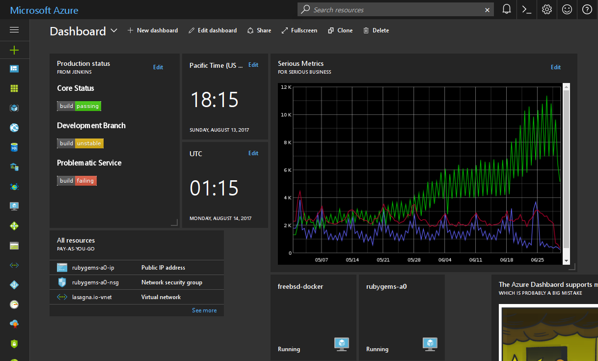
I hope whoever thought of adding the Markdown tile received a raise for their ingenuity since it’s the difference between the Azure Portal’s home page being an annoying interstitial page and an infrastructure home page which I rely on as a high-level overview.
Adding the tile
Assuming you’re already using Azure, adding the tile is supremely easy:
- From the Azure Dashboard, click Edit dashboard.
- Drag the “Markdown” tile into the Dashboard.
- Edit the Markdown to include images and other useful information.
- Profit!